The Complete Resume Checklist for 2026: 25 Things to Verify Before You Apply
Most resumes are not rejected because the candidate was unqualified. They are rejected because something small went wrong: a phone number buried in a header the software could not read, a summary that said nothing, a skills section that did not match the job. The average recruiter spends only about 7.4 seconds on a first scan, and before a recruiter sees it at all, the document usually passes through software. Nearly run an applicant tracking system, and about 75% of recruiters rely on one to sort and rank applicants.
That two-layer reality, machine first and human second, is exactly why a checklist beats inspiration. You can write a brilliant resume and still lose the interview to a formatting mistake you never noticed. I have reviewed thousands of resumes as the founder of CareerKit, and the same fixable problems show up again and again.
This is the full pre-flight checklist I use. Twenty-five items, grouped in the order a recruiter actually experiences your resume, from the contact line at the top to the final proofread before you hit send. Work through it once and your resume will already be ahead of most of the stack. If you would rather build from a structured starting point, our resume builder bakes most of these checks in for you.
Get the Essentials Right at the Top
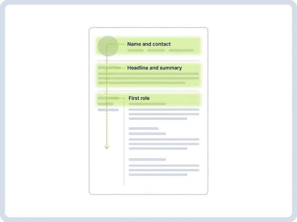
The top third of your resume is the most valuable real estate you own. It is where the eye-tracking research shows recruiters spend most of their attention, and where the software grabs your target role and core keywords. Everything in this section needs to earn its place.
Complete Contact Information
What belongs here is simpler than people think: your full name, a professional email address, a phone number, your city and region, and a link to your LinkedIn profile or portfolio. That is it. You do not need your full street address, your date of birth, a headshot, or your marital status, and several university career centers actively advise removing personal data like that, because it adds clutter and can introduce bias.
The most common and most damaging mistake is putting contact details inside the document header or footer. Many tracking systems do not read those zones reliably, so your phone number can vanish before a human ever sees it. Keep your contact line in the main body of the page, and use an email address built from your name rather than a nickname you created in school.
Before: bigmike_party99@email.com, no location, phone tucked in the page header
After: michael.reyes@email.com, +1 415 555 0148, San Francisco, CA, linkedin.com/in/michaelreyes, all in the top line of the body
One quiet detail makes this matter even more: recruiters do look you up. About 67% of recruiters review a candidate's LinkedIn profile before extending an offer, so the profile your link points to should match the resume it sits on.
A Compelling Resume Headline
A headline is the one-line label directly under your name that tells the reader, in plain language, what you are. It is not a slogan. It is the human version of the keyword the software is hunting for, and it orients the recruiter in the first second of the scan.
The best practice is to mirror the title in the job posting when it fairly describes you, then add a specifying detail. Vague headlines waste the most visible line on your page.
Before: Hard-working professional seeking new opportunities
After: Senior Financial Analyst | FP&A, SaaS, and Forecasting
Before: Marketing Guru
After: Digital Marketing Manager | SEO and Paid Acquisition
Notice that the "after" versions would also surface in a keyword search, while the "before" versions match nothing a recruiter would ever type.
A Strong Professional Summary
The summary is two to four lines under your headline that answer one question: why should this reader keep going? It replaces the dated objective statement, which talked about what you wanted instead of what you offer.
Write it specific to the role and lead with evidence. A generic summary is one of the most skipped blocks on a resume, because it tells the recruiter nothing they cannot already see.
Before: Results-driven team player with excellent communication skills looking to leverage my abilities in a dynamic organization.
After: Operations manager with 8 years in e-commerce logistics. Cut fulfillment costs 22% across three warehouses and led a 40-person team through peak season with zero missed SLAs.
The second version works because every claim is concrete and checkable. That is the standard to hold every line of your summary to.
Build a Resume That Survives the ATS
Before a person reads a word, your resume is parsed, scored, and ranked by software. Contrary to the myth that these systems automatically reject most applicants, the research suggests they mostly act as a search-and-filter tool for recruiters. Your job is to make sure nothing about your formatting or wording stops you from showing up in that search.
ATS-Friendly Structure and Formatting
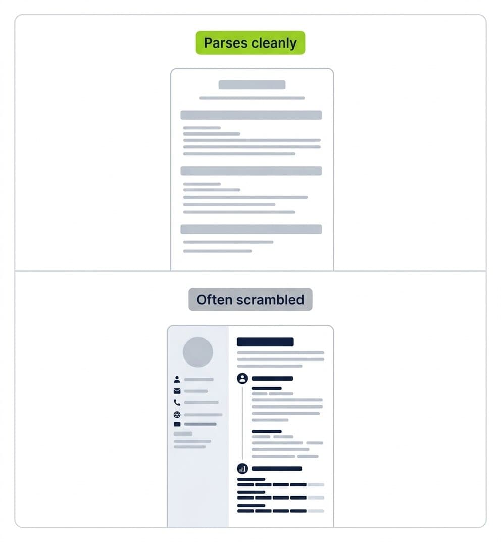
What the software wants is boring on purpose: a single-column layout, standard section headings such as Experience, Education, and Skills, conventional fonts, and no critical text trapped inside images, tables, or text boxes. Anything fancy risks being scrambled on the way in.
The practical rule is to design for the parser first and decorate second. Multi-column templates, graphics used as text, and icons standing in for section labels are the usual culprits behind a mangled parse. If you want to see how your layout reads once stripped to plain text, that is a useful final test before submitting.
Before: a two-column template with a sidebar of skill rating bars and section icons instead of words
After: a single column, the heading "Core Skills" spelled out, and the skills listed as plain text
Relevant Skills Pulled From the Job Posting
A dedicated skills section is no longer optional, because skills-based filtering now drives a lot of screening. What you need is a short, honest list of the abilities the role actually calls for, written in the same words the posting uses.
The best practice is to read the job description, note the exact skill terms, and reflect the ones you genuinely have. "Spreadsheet software" and "Excel" are not the same to a keyword match, even though they mean the same thing to you. If you are staring at a blank section, our resume skills generator can suggest role-relevant terms to start from.
Before: Skills: Microsoft Office, hard worker, fast learner, team player
The red flag to avoid is keyword stuffing. Listing skills you cannot defend in an interview is a fast way to lose credibility once you are in the room.
Industry-Specific Terminology
Every field has its own vocabulary, and using it correctly signals that you belong. What you need is the right technical and professional language for your industry: the tools, methods, certifications, and frameworks an insider would recognize.
Use the terms a hiring manager in your field would use, not generic descriptions of them. At the same time, spell out an acronym once before you lean on it, because the first reader might be a recruiter from outside your specialty.
Before: Used a system to manage customer relationships and a method for organizing work in stages
After: Managed the pipeline in Salesforce and ran delivery on a two-week Agile sprint cycle
The Correct File Format
The format you submit in decides whether your careful formatting survives the trip. According to Indeed, you should default to a PDF or a Word document and avoid anything more exotic, because other file types may not open or parse cleanly.
The overriding best practice is to follow the instructions in the posting. If the application asks for a .docx, send a .docx. If it gives no preference, a PDF preserves your layout most reliably. Name the file clearly, something like FirstName-LastName-Resume, rather than "resume-final-v7."
Design for the Human Eye
Once your resume clears the software, a tired human has to be able to read it fast. This section is about respecting that reader's few seconds of attention. None of it is decoration; every choice here either speeds the scan or slows it.
A Clean, Readable Font
What you want is a professional, widely available typeface set at a readable size. Purdue's writing lab advises keeping body text no smaller than 10 point, and university career resources point to standards like Arial, Calibri, Garamond, or Helvetica in black, between 10 and 12 point.
Best practice is to pick one font and use it consistently, letting size and weight rather than a second typeface create hierarchy. Decorative or script fonts, light grey body text, and anything below 10 point are the usual readability killers. You can compare how your resume looks in different typefaces with our resume font preview tool before committing.
Appropriate Margins and White Space
Bereit fuer Ihren Traumjob?
Schliessen Sie sich 50.000+ Jobsuchenden an, die ihre Karriere bereits mit unserem KI-gestuetzten Lebenslauf-Builder verwandelt haben.