Best Cover Letter Fonts in 2026: Size, Spacing & Top Picks
The best cover letter fonts for 2026: top picks, the right size and spacing, and whether to match your resume so your letter looks polished and gets read.
Choosing the right font for your cover letter might seem like a small detail, but it plays a crucial role in making a strong first impression. A well-chosen font enhances readability, conveys professionalism, and subtly communicates your personality to hiring managers. In fact, according to hiring research published by Indeed, presentation and visual attention to detail are among the first signals recruiters use to assess candidate effort before they read a single word. This article explores the best fonts for a professional cover letter, offering insights into why font selection matters and how to pick the perfect style for your industry and personal brand.
Why Font Choice Matters in Your Cover Letter
Fonts are more than just letters on a screen; they carry emotional weight and influence how your message is perceived. Typography research from the Nielsen Norman Group shows that serif fonts are closely associated with tradition and authority, qualities that carry weight in fields like law and finance. Modern sans-serif fonts signal clarity and forward momentum, making them a better fit for tech and startup environments. Choosing the right font is a deliberate branding decision that tells a recruiter something about your professional judgment before they read a single sentence. You can preview how each font looks in a real document using the Careerkit Font Preview Tool.
Beyond aesthetics, font choice affects readability. Hiring managers often skim through dozens, if not hundreds, of applications. A clear, legible font ensures your cover letter is easy to read and that your key points stand out. According to SHRM's talent acquisition research, hiring managers consistently flag visible effort and presentation quality as a differentiator between candidates with similar experience, and font choice is a measurable part of that first impression. Furthermore, the right font can enhance the overall visual hierarchy of your cover letter, guiding the reader's eye to the most important elements, such as your skills and achievements.
The Psychological Impact of Fonts
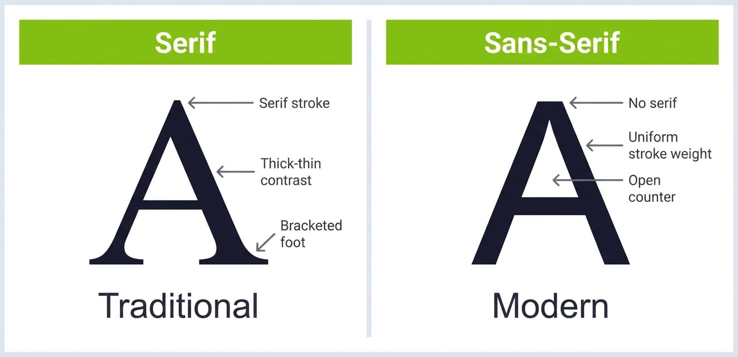
Fonts can subtly influence the reader’s perception of your professionalism and attention to detail. Serif fonts, which feature small lines or strokes attached to the ends of letters, often convey a sense of formality and trustworthiness. Sans-serif fonts, which lack these strokes, tend to feel clean, modern, and straightforward. This distinction can be crucial when applying for positions where the company culture is either traditional or innovative. For instance, a startup might appreciate a fresh, sans-serif font that reflects their dynamic approach, while a well-established corporation may favor a classic serif font that communicates stability and reliability.
A practical way to apply typography hierarchy is to set your name in a bold weight of your chosen font while keeping the body text in the regular weight. This creates contrast and visual structure without introducing a second typeface. The result is a document that guides the reader's eye naturally without competing for attention. Additionally, the size and spacing of your font can also play a significant role in how your cover letter is received. A font that is too small may strain the reader's eyes, while excessive spacing can make your letter appear disjointed. A well-considered font choice, combined with appropriate sizing and spacing, can enhance the overall presentation of your application and make a lasting impression on potential employers.
Top Fonts for a Professional Cover Letter
When selecting a font, it’s important to consider industry standards, readability, and the tone you want to set. Here are the top fonts recommended for professional cover letters. Each entry below includes a real cover letter example so you can see the tone each font creates. To preview any of these fonts in your own document before committing, use the Careerkit Font Preview Tool.
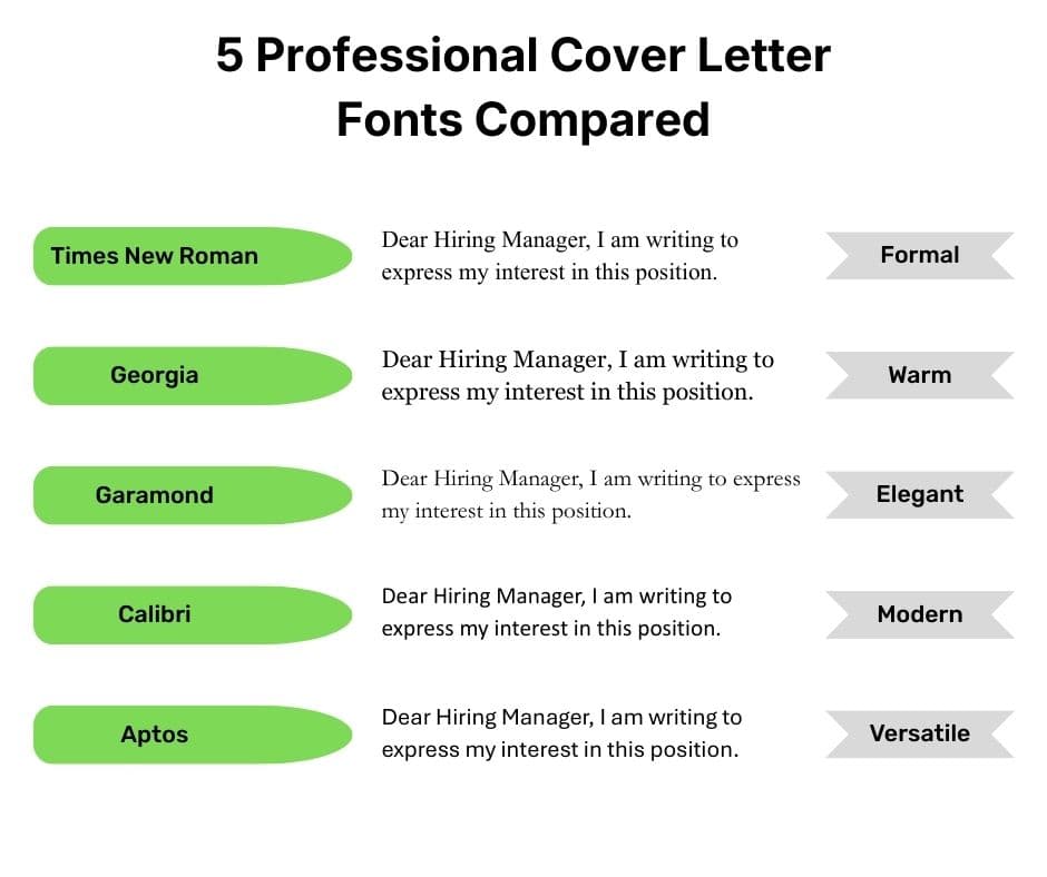
1. Times New Roman
Times New Roman remains a classic choice for cover letters and resumes. Its serif style is widely recognized for its legibility and formal appeal. A resume font analysis by SEEK identified Times New Roman as one of the top recommended fonts for professional documents, valued for its timeless legibility and near-universal recognition across industries and applicant tracking systems.
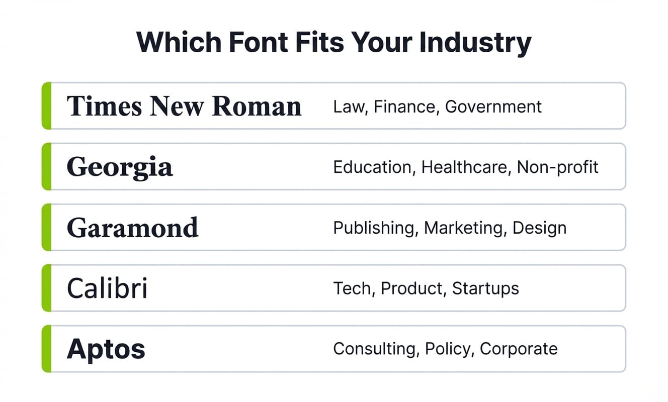
This font is particularly suitable for traditional industries like law, finance, and government roles, where a conservative and polished appearance is expected. Its familiarity can also make your cover letter feel trustworthy and authoritative. Additionally, Times New Roman's widespread use in academic and professional settings evokes credibility, making it an excellent choice for candidates who want to establish a serious, authoritative tone. See how it renders at different sizes using the Careerkit Font Preview Tool.
"I am writing to express my interest in the Senior Compliance Officer role at Barclays. With seven years of regulatory experience in financial services, I have developed a thorough understanding of the frameworks your team navigates daily."
Times New Roman, 11pt. Reads with formal authority. Best for law, banking, government, and public sector applications.
2. Georgia
Georgia is another serif font that offers a slightly more modern twist on traditional typography. It’s designed to be highly readable on screens, making it an excellent choice for digital applications. Georgia was specifically designed by Microsoft for high legibility on screen, making it a reliable choice for digital job applications where your cover letter will be read on a monitor before it is ever printed.
Georgia’s slightly larger letterforms compared to Times New Roman can also make your cover letter feel more approachable while maintaining professionalism. This font's warm and inviting aesthetic helps create a personal connection with the reader, which is particularly valuable in fields like education and healthcare, where empathy and approachability matter as much as credentials.
"I am excited to bring my five years of classroom experience to the 4th Grade Lead Teacher position at Riverside Elementary. My approach centers on student-led inquiry, differentiated instruction, and consistent family communication."
Georgia, 11pt. Warm and readable. Best for education, healthcare, non-profit, and social services roles.
3. Garamond
Bereit fuer Ihren Traumjob?
Schliessen Sie sich 50.000+ Jobsuchenden an, die ihre Karriere bereits mit unserem KI-gestuetzten Lebenslauf-Builder verwandelt haben.
Garamond is a stylish serif font known for its elegance and readability. It’s often favored by professionals who want to convey sophistication without sacrificing clarity. Like Georgia, Garamond carries a sense of tradition, which can be advantageous in conservative fields.
Its graceful curves and balanced spacing make it a pleasure to read, helping your cover letter stand out subtly among more commonly used fonts. Garamond is closely associated with literary works and publishing, making it an ideal choice for candidates in creative industries like writing, design, and marketing, where a touch of artistry strengthens the overall impression.
"As a brand strategist with a decade of experience building editorial identities for independent publishers, I believe the intersection of language and design is where the most meaningful creative work happens."
Garamond, 11pt. Elegant and editorial. Best for publishing, communications, design, and marketing roles.
4. Calibri
For those applying in the technology sector or more modern industries, Calibri is a widely used sans-serif choice. It has been the default font in Microsoft Office since 2007, which means it renders cleanly across virtually every device and email client without substitution errors or formatting shifts when a recruiter opens your file. Its clean lines communicate efficiency and clarity, and its slightly rounded edges give it a friendly feel without sacrificing professionalism, making it a natural fit for startups, product companies, and any organization that values a modern, collaborative culture.
"I'm applying for the Product Manager role at Notion. Over the past three years at Atlassian, I shipped four cross-platform features that reduced support ticket volume by 34 percent while improving NPS by 12 points."
Calibri, 11pt. Clean and contemporary. Best for software, product, fintech, and startup roles.
5. Aptos
Introduced as Microsoft's new default font in 2023, Aptos strikes a balance between traditional professionalism and modern readability. This makes it an ideal choice for formal industries that also value a contemporary edge.
Microsoft designed Aptos specifically for clarity across both print and digital surfaces, which gives it a practical advantage for job applications submitted in multiple formats. If you are applying to roles that span corporate, consulting, or public-sector environments, Aptos is a strong current choice that feels polished without feeling dated.
"I am applying for the Senior Policy Analyst position at the European Commission. My background spans five years of evidence-based research in climate and energy regulation across three EU member states."
Aptos, 11pt. Institutional yet modern. Best for consulting, policy, finance, and cross-sector professional roles.
What Font Size and Spacing to Use, and Whether to Match Your Resume
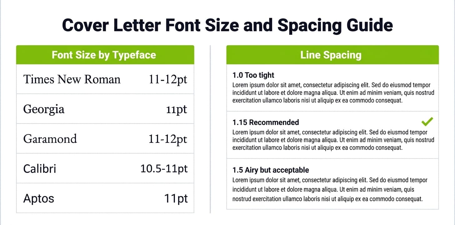
A great cover letter font still fails if the size or spacing is off. Set your body text between 10.5 and 12 points: 11 or 12 for a shorter letter, 10.5 when you are fighting to keep everything on one page. Below 10 points strains the reader, and above 12 looks padded. Use single or 1.15 line spacing, a blank line between paragraphs instead of indents, and one-inch margins on every side so the page can breathe. Preview how each font looks at different sizes before you commit, since the same point size renders noticeably larger in Georgia than in Calibri.
Should your cover letter font match your resume? Yes. A recruiter almost always sees the two documents side by side, and one consistent typeface reads as deliberate and organized, while two different fonts look like two different people wrote them. Pick one font from the list above and apply it across your resume, cover letter, and any reference page. When the writing itself is ready, build your cover letter in Careerkit so the spacing and margins are handled for you. If you are still deciding whether you even need one, our cover letter vs resume guide explains when it matters most.
Tips for Using Fonts Effectively
Picking the right font is only half the job. How you apply it across your document determines whether the result feels polished or patchy. These three principles will help you get the most out of whichever font you choose, whether you are starting from scratch or refining an existing draft. If you want the formatting handled for you, the Careerkit Cover Letter Builder applies professional typography and spacing automatically.
Keep It Simple and Consistent
Stick to one or two fonts at most. Using too many fonts can make your cover letter look cluttered and unprofessional. For example, you might use a bold version of your chosen font for your name or headings, while keeping the body text in a regular style.
Consistency in font size, spacing, and alignment also contributes to a clean and polished appearance. As a general rule, 11pt works well for most fonts. If you are using Times New Roman or Garamond, you may find 11pt or 12pt reads better due to their smaller x-height. Calibri and Aptos appear larger at the same point size, so 10.5pt or 11pt is usually the right call. Additionally, use line spacing between 1.15 and 1.5 to give the text room to breathe without creating awkward gaps. One step most candidates miss: always export your cover letter as a PDF before sending. This locks in your font choice and prevents substitution errors that occur when a recruiter opens a .docx file on a system without your chosen font installed. When you build your cover letter with Careerkit, this is handled automatically.
Match Your Font to the Industry
Consider the norms and expectations of the industry you’re applying to. Traditional fields like law, finance, and academia often favor serif fonts like Times New Roman or Garamond. Creative and tech industries may be more receptive to modern sans-serif fonts like Calibri or Aptos.
Customizing your cover letter to the job and company culture is one of the clearest ways to signal that you understand the environment you are entering. Researching the company's visual branding can guide your font decision: a startup with a modern identity will respond better to Calibri or Aptos than to Times New Roman. A century-old financial institution will feel the opposite. The same logic applies to your resume, where font consistency across both documents reinforces your professional attention to detail. For a full breakdown of how formatting expectations vary by section, see the guide on the anatomy of a strong resume.
Prioritize Readability
No matter how stylish a font may be, if it’s hard to read, it will work against you. Avoid overly decorative or script fonts that can distract or confuse the reader.
Ensure there’s enough contrast between the font color and the background, and use standard black or dark gray text on a white background for maximum clarity. Short, focused paragraphs do more for readability than any formatting trick. Keep each paragraph to three or four sentences and lead with your strongest point. Hiring managers reading dozens of applications will skim the opening line of each paragraph first, so front-loading your most relevant qualification makes the letter easier to process under time pressure. The goal is a document that invites the reader in rather than asks them to work to find your value.
Final Thoughts: Making Your Cover Letter Stand Out
Your cover letter is your personal introduction to a potential employer. While the content of your letter is paramount, the way it’s presented can significantly influence the reader’s perception. Selecting the right font is a subtle yet powerful way to enhance your professionalism and make your application memorable.
By choosing fonts like Times New Roman, Georgia, Garamond, Calibri, or Aptos, you align your cover letter with industry expectations and readability standards. Pairing your font choice with thoughtful formatting shows hiring managers that you have invested real care into your application, and that visible effort is what separates a forgettable letter from one that earns a callback. To see how your cover letter fits into the broader picture of what recruiters evaluate first, read our guide on what hiring managers actually read first when reviewing applications.
Ultimately, the best font for your cover letter is one that complements your message, suits your industry, and makes your letter a pleasure to read. Paying attention to these details is the kind of deliberate preparation that gets noticed. Once your cover letter is dialed in, make sure your resume matches the same level of polish. Use the Careerkit Resume Builder to build an ATS-ready resume that pairs cleanly with your cover letter and gives recruiters a consistent, professional first impression across your entire application.
Take the Next Step in Your Career Journey with Careerkit
You have already done the thinking. You know which font suits your industry, how to size and space it correctly, and how to export it so it reaches recruiters exactly as intended. Now put it together. The Careerkit Cover Letter Builder gives you ATS-friendly templates with professional typography built in, AI writing assistance to sharpen your opening and body paragraphs, and one-click PDF export so your font choice stays intact from your screen to the recruiter's inbox.
The best fonts for a cover letter are Times New Roman, Georgia, Garamond, Calibri, and Aptos. The right choice depends on your industry. Serif fonts like Times New Roman and Garamond suit traditional sectors such as law and finance. Sans-serif fonts like Calibri work better in tech and startup environments. Aptos is a strong all-rounder for corporate and consulting roles.
11pt is the safest default for most fonts. Times New Roman and Garamond have a smaller visual footprint, so 12pt is also acceptable for those. Calibri and Aptos appear larger at the same point size, so 10.5pt or 11pt is usually right. Always pair your chosen size with 1.15 to 1.5 line spacing.
Yes. Using the same font across your cover letter and resume creates a cohesive, professional presentation. Recruiters often view both documents side by side, and mismatched fonts create an impression of inconsistency.
Both are technically acceptable but overused in corporate documents and can make your cover letter feel generic. Calibri or Aptos are stronger choices because they were designed specifically for professional document readability and render more cleanly on screen.
No. Script, handwritten, and decorative fonts are not appropriate for cover letters in any industry. They are difficult to read at body text sizes, often fail ATS parsing, and signal a lack of professional judgment. Even for design roles, your portfolio carries the creativity. Your cover letter should be clean and easy to read.
Unusual or decorative fonts can create character recognition errors in ATS systems. Standard fonts like Calibri, Times New Roman, Georgia, Garamond, and Aptos are all ATS-safe. Always submit as a PDF to ensure the font is embedded and the text is preserved exactly as written.
Serif fonts (Times New Roman, Georgia, Garamond) have small strokes at the ends of each letter and are associated with tradition and formality. Sans-serif fonts (Calibri, Aptos) have no such strokes and read as clean and modern. The right choice depends on the culture and expectations of the industry you are applying to.
Export your cover letter as a PDF before sending. When you send a .docx file, the font only displays correctly if the recipient's device has that font installed. A PDF embeds the font into the file itself, so your cover letter looks exactly as you designed it regardless of what device or email client the recruiter uses.
Setzen Sie diese Tipps in die Praxis um
Sie kennen jetzt die Theorie. Der KI-Builder von Careerkit macht daraus einen ATS-optimierten Lebenslauf, zugeschnitten auf Ihre Wunschstelle.
Nishant Modi is the founder of Careerkit.me and a product builder based in Zürich, Switzerland. With a background in product management, marketing & management consulting, he transitioned into AI entrepreneurship after experiencing the frustration of outdated job search tools firsthand. He built Careerkit to give every job seeker access to professional grade resume tools, the platform has helped over 10,000 candidates create ATS optimized resumes. He writes about resume strategy, hiring trends, and what actually gets people hired.