A resume template is not decoration. It is the frame that decides whether a hiring system can read your experience and whether a busy recruiter can find your best work in a few seconds. Get the template right and your content does its job. Get it wrong, with sidebars, icons and two-column tricks, and even a strong career reads as noise. This guide covers the resume templates that actually work in 2026: the formats that win, the rules every good template follows, and where to get one that stays readable to both software and people.
I have reviewed thousands of resumes as a career coach, and the pattern is consistent. The candidates who get interviews rarely have the flashiest design. They have the clearest one.
What makes a resume template "good" in 2026
Two audiences read your resume, in this order: an applicant tracking system (ATS) that parses your file into a database, then a human who skims what survived. A good template serves both. Around 71% of organisations now run an ATS, and among large employers the number is far higher, so a template that a parser cannot read is a template that hides you.
ATS-readable structure comes first
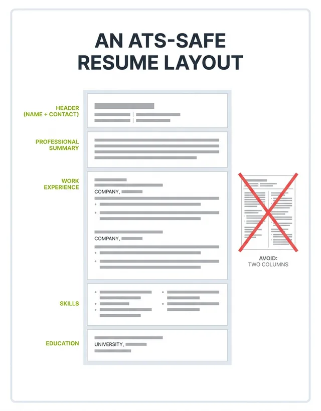
ATS-readable means a single-column layout, standard section headings ("Work Experience", "Education", "Skills"), a common font, and no text trapped inside images, text boxes, headers or footers. Here is the myth to drop: modern systems do not bulk-reject resumes over formatting. Vendors report that the software is used to search and rank candidates, not to auto-bin them, and the widely repeated "75% of resumes are rejected by an ATS" figure traces back to a defunct 2012 startup with no published method. The real risk is quieter: a two-column template whose sidebar gets parsed out of order, so your skills land in the middle of a job description and a recruiter sees gibberish.
If you want to see how a system reads your file before you send it, run it through a checker. Our free ATS resume checker flags the parsing traps a pretty template hides.